A donation page is one of the most important tools in your nonprofit’s arsenal and plays a major role in your fundraising. It is a dedicated web page that informs donors about your cause, mission, and goals. It provides a place for people to connect with your organization and donate whenever it’s most convenient for them.
Its significance cannot be overstated. Want your donation page to stand out? Here are 10 examples that have been proven to increase donations.
1.Prison Fellowship International:
Prison Fellowship International is an organization that aims to help suffering children whose parents are imprisoned in some of the poorest countries in the world. When a donor chooses to sponsor a child, they are given an exact rundown of how their donation will help said child. Making sure that the donation page copy provides an abundance of clarity on how a donation will be used has let them see a 69% increase in donations.
2. SisterLove:
SisterLove is an organization that empowers women through advocating for sexual and reproductive health rights and justice. They aim to eradicate the adverse impact of HIV impacting women and their families through education, prevention, support, research and human rights advocacy. Its donate button is clear for all to see. Its text a different color than the rest of the page- a bright and eye-catching shade of yellow. It immediately draws the attention of potential donors, making it easy to find.
3. Sanibel-Captiva Conservation Foundation:
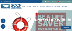
The Sanibel-Captiva Conservation Foundation aims to teach greater eco-awareness through its exhibits and trails. Its donation page is a great example of how one’s donation page is branded and aligned with the aesthetics of one’s organization can increase donations. Custom branded donation pages help raise as much as six times the money on average.
4. Quest Bridge:
Quest Bridge is a nonprofit organization that aims to connect low-income and first-generation students with partner colleges and universities that offer them scholarships. Donor retention is extremely important to nonprofits, and one easy way to increase retention is by offering recurring donations; which is exactly what Quest Bridge has done.
5. Black Girls Smile:
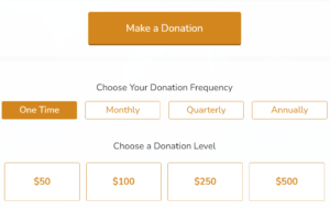
Black Girls Smile is a nonprofit that empowers the mental well-being of young black girls. BGS enhances the donor experience by making things more convenient for its donors. One way in which it does this is by offering different ways in which its donors can give- by highlighting different donation frequencies, donation levels and by letting the donor input their own amount.
6. Oxfam America:
Oxfam is a global organization that aims to fight inequality to end poverty and injustice. The organization increases donor engagement by offering different and multiple ways in which its audience can engage with its mission; this added flexibility also increases their donor retention rate.
7. My Block, My Hood, My City:
My Block, My Hood, My City (also known as M3) is a non-profit based in Chicago that mentors underprivileged youth through educational programs and field trips. One of the ways in which it makes it easier for its donors to get additional information that they might need is by showcasing its most pertinent information on a single page; it’s donation page includes their mission statement, an annual report, the ever-so important donate button, a link to the their FAQ and a list of many ways to give. This reduces the number of clicks a donor needs to make in order to access the information they want and need.
8. Color of Change:
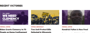
Color of Change is a nonprofit organization that advocates for civil rights. One thing that it does amazingly is that it provides proof of social change by highlighting recent victories that it has helped obtain. This transparency creates a sense of trust within the donor as they are able to see exactly how their contribution has helped people.
9. Direct Relief:
Direct Relief is a nonprofit that provides emergency medical assistance and disaster relief within the US and internationally. It provides its donor with a simple and clear experience, taking the hassle out of the process and greatly simplifying it. This is further highlighted by how its donate feature is the first thing that a donor sees when opening the website.
10. Trevor Project:
The Trevor Project is a nonprofit organization that focuses on suicide prevention efforts among LGBTQIA+ youth. One way in which it increases the number of donations it gets is by making its donation page and website mobile friendly. 98.7% of social media users across all platforms access websites through their mobile. It is therefore important that you tap into this demographic.
By emulating these techniques used by well-known and successful nonprofits, you will also be able to grow your organization to new heights.
If you’ve found this article helpful and need further assistance with growing your nonprofit, contact Support Black Charities


